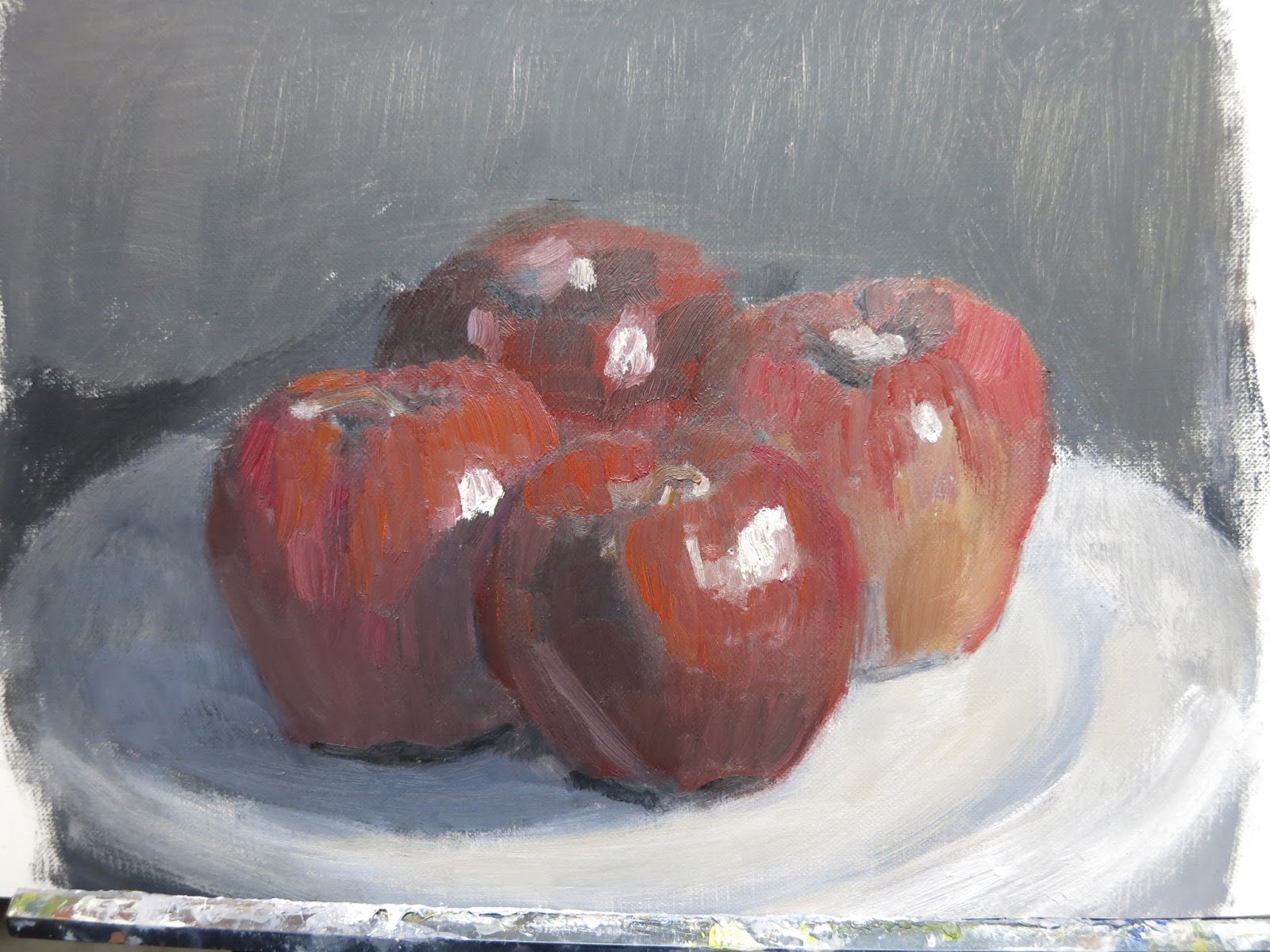
I have been struggling with these and I think it shows. The color added in is tentative, the rendering is sketchy and I didn't triple check my ellipses and perspective.
Nevertheless, I learned a LOT!
To begin with these are all still grisaille paintings. Grisaille being painting in black and white. The color comes from my learning of color temperature and adding alizarin crimson, ultramarine blue, or cadmium yellow medium to the varying shades of gray that adorn my palette. If I look at each one of these, I am making faces not fit for a camera. If I look at all 5 as a group, I can see my thinking and progress with each one. I hope you can do the same.
For this one I was trying to add a little more to the composition with the folded cloth, but then I made it too much to handle in my 2 hour time limit. I like the edges I was getting on the saucer and the warm/cool of the porcelain. The perspective on the box of tea is also not bad. But getting the cloth used up a lot of my time and I didn't have my usual check perspective and measuring tome at the end of my session. And then I realized the cup was sitting a bit off in relation to the saucer. My grade based on this painting (keep in mind, I'm giving it too myself, so there's never really an A+) is a C.
This next one earned a B. I didn't like the set up, but I wanted something simple after the more complex composition I had just finished. The apple in the front and the same value, but half warm half cool section on the apple to the left is what boosted my grade.
This one gets a D. I allowed myself to be distracted (4yos and a stream of comments on new bathroom installation will have that affect), and in the end muddied up all the work I had done on the wine bottle. The only part that keeps me from throwing it out is the apple and the bottom portion of the wine bottle.
Getting back up to a B, getting close to an A. The perspective on the ellipse got a bit pinched. But I like the apple and the glass. The background is distracting.
Gave myself an A, finally. I painted the grisaille on this one and then went over it with color, matching the values. I like how bold it turned out and varying degrees of red I managed to mix, both cool and warm.


Comments